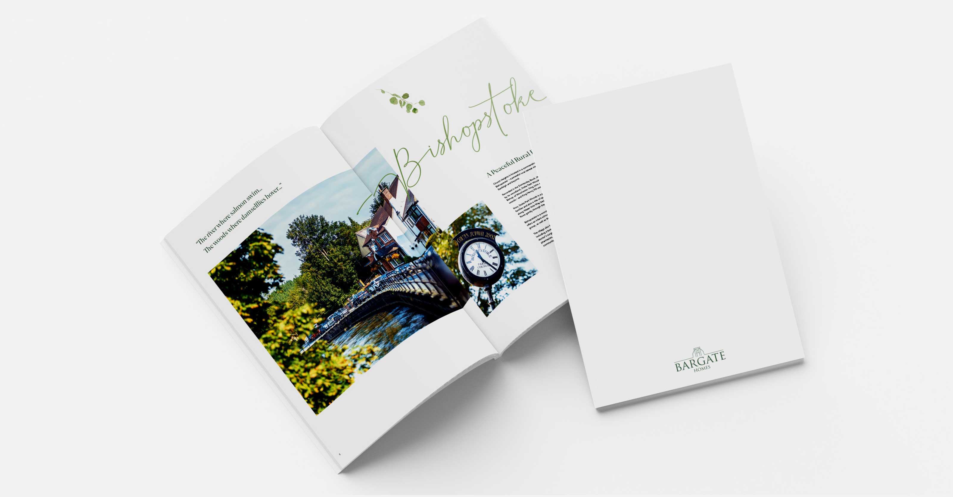
Capturing their essence on paper

The look and feel of a brochure leaves a lasting impression on your audience, it colours their view of the brand and its products through a permanent, tangible element they can refer back to. In the case of a regional new housebuilder like Bargate Homes, a welldone brochure can make a sale.
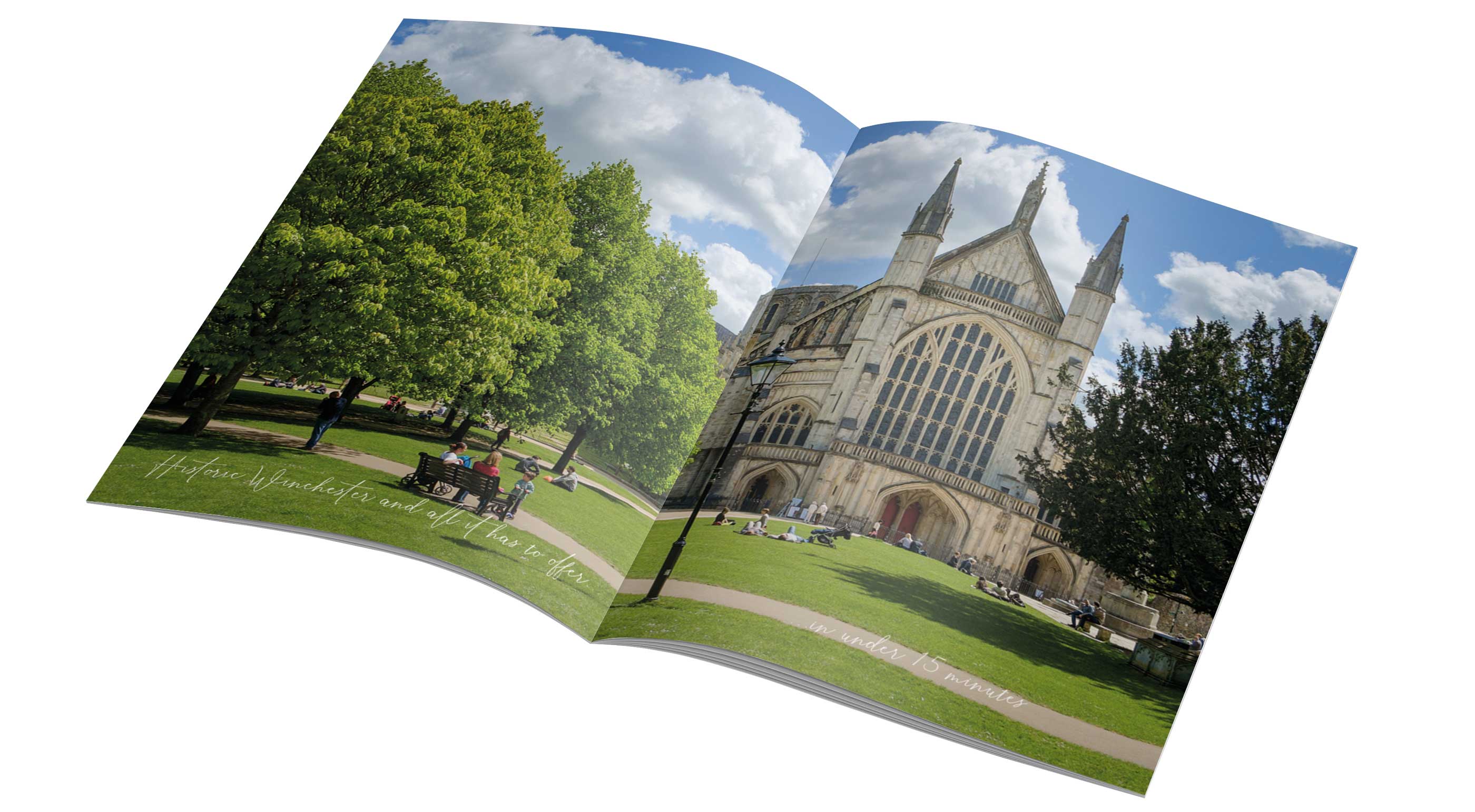

When presented with Church Heights, a secluded development surrounded by trees, we immediately felt an affinity for the arboreal with elegant and modern elements. After spending time in Bishopstoke and soaking up village life, interviewing local businesses and spending time with the photographer in the village, an extroadinary and memorable brochure was the result. It’s magazine style with alluring spreads and eye-catching photography draws you deeper into its pages.
Showing Bargate cares

The message woven throughout the brochure is that of ‘We care’, which
includes six values.
Bargate aspires and meets on a daily basis. They not only show their
prospective customers that they care through content but also through the
tangible qualities of the brochure.
From verdant to vibrant

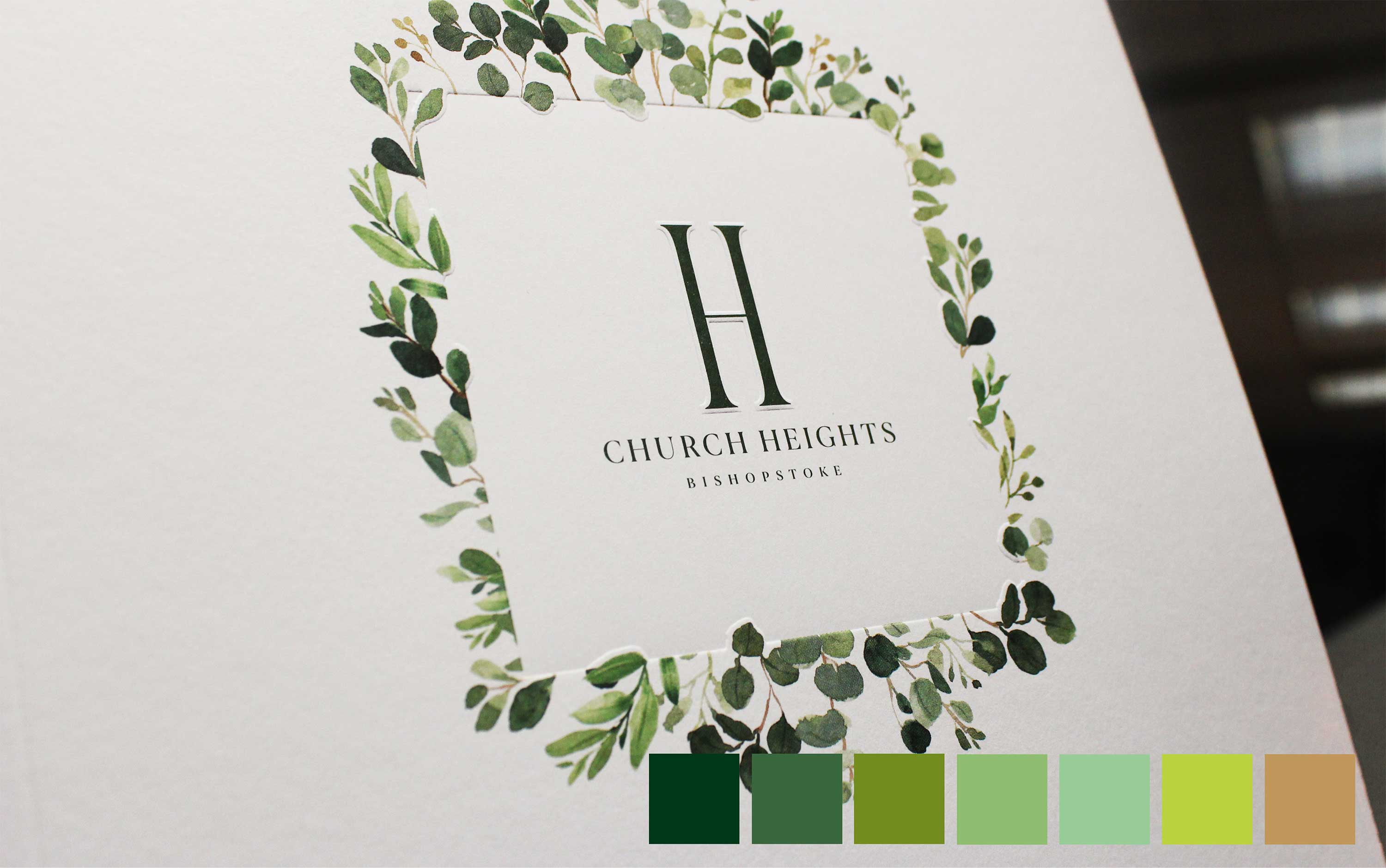
The tactile, rustic texture of the cover stock harmonizes with the naturalness of the chosen botanical theme consistently used throughout the brochure. To enhance the uncluttered cover design, a custom debossing die was cut to give a subtle and immediate impact.
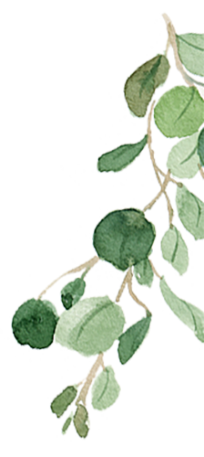
A monochromatic colour palette of green and bright white makes this brochure fresh and inviting, just like the development’s location. The watercolour leaves add a transient and expressive feel that contrasts nicely with the solid, permanence of a Bargate Home.
TL:DR

The stylistic choices, including our fonts and imagery give this brochure a warm and modern feel perfectly illustrating the corresponding copy.

Making sense of marketing
in the digital age
Third Floor, Towers Point
Towers Plaza
Wheelhouse Road
Rugeley, Staffordshire
WS15 1UN
Glen Mitton Limited. All Rights Reserved