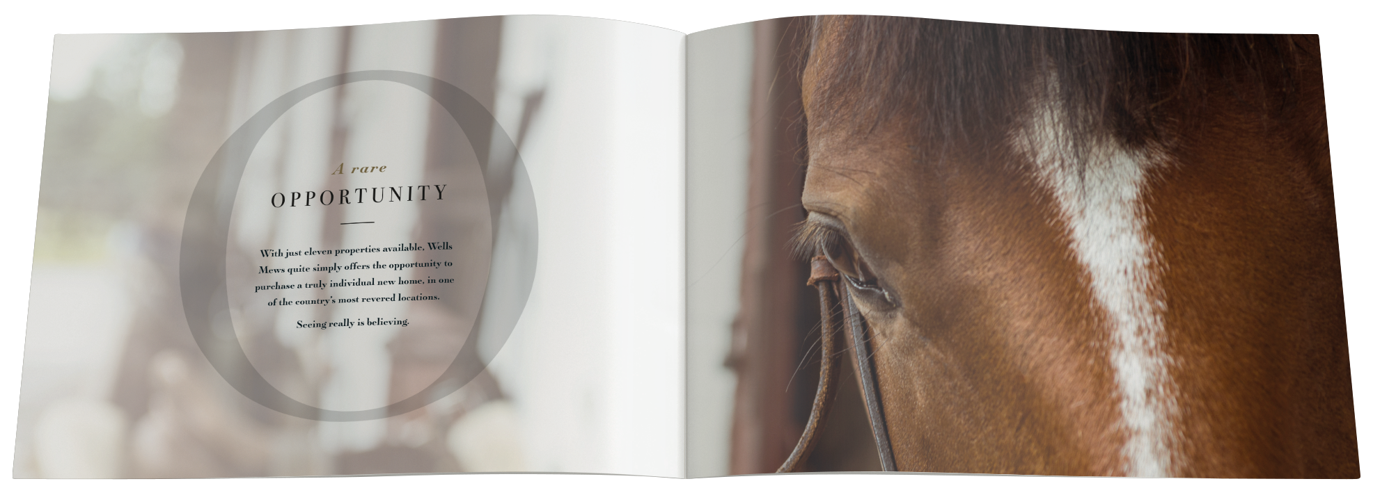
Because housebuilder communication converges into a predictable sameness, owning a brand mnemonic is crucial for stand-out.

When you're heavily outspent by the competition and you're operating in a South East marketplace dominated by well established brands, you need both visability and appeal.
Reaffirming the Oakford 'O'

It's a visual mnemonic that Oakford Homes already owns. Why not bring that to the fore in a way that’s both engaging and aspirational?
It frames their communication and strongly brands all they do. Simple. But 'simple' is easily recognised. 'Simple' stands-out. And 'simple' sells.
Stylishly Art-Directed

With a use of concisely-crafted copy and elegant colourways; this stylishly art-directed work furthermore positions Oakford as an upmarket, design-focused brand.

Client Seb Kemp eloquently summarises:

"The device is so simple, but so effective in giving us consistent standout and appeal"

Making sense of marketing
in the digital age
Third Floor, Towers Point
Towers Plaza
Wheelhouse Road
Rugeley, Staffordshire
WS15 1UN
Glen Mitton Limited. All Rights Reserved