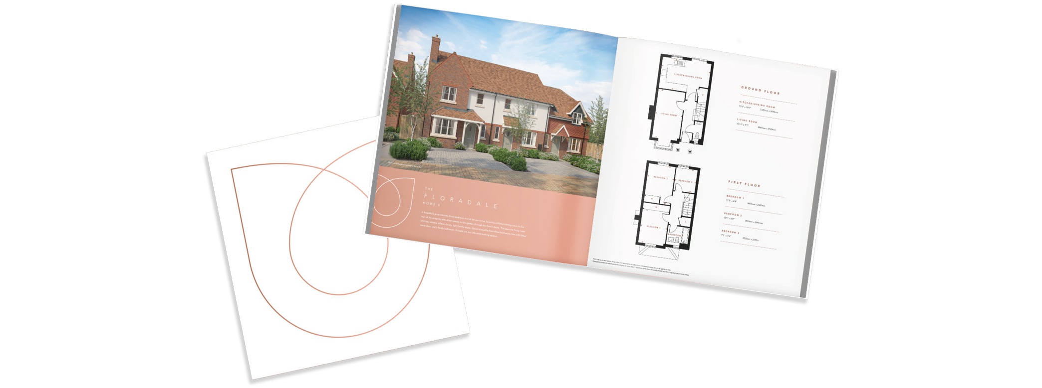
Development identity & brochure design

When long-standing client Oakford Homes asked us to produce a brochure for their development based in the picturesque village of Chipperfield we dived deep into the history of the construction site and its heritage. Formerly a garden centre, the site offered 15 homes, finished to Oakford’s high specification. The former family-run, 100-year-old garden centre was notorious for its tulips. The development name ‘Tulipa’ was born, and each house type was named after a variety of tulip.
Cultivating the unique brand

Creating a unique brand identity for Tulipa was at the centre of our vision. We knew the branding needed to represent the tulip, which would be easily recognisable as its namesake. The delicate logo is a nod to the flowers from which the development is named. The brand identity flows through the spreads, creating a seamless and beautiful brochure that acknowledges the nature that surrounds the homes.
Showcasing the community

Tulipa is located in the rural village of Chipperfield, at the heart of the village is Green Flag-awarded Chipperfield Common, a beautiful green which is the hub of the community. Perfectly positioned, Tulipa offers a selection of local shops and cosy pubs right on its doorstep. We aimed to showcase Tulipa’s location for its beauty and community spirit, communicating its idyllic location to the audience.
A touch of elegance

To portray the nature of the site, we knew that we needed to choose a sophisticated colour-way that showcased the development and Oakford’s brand. Rose gold tones were chosen to highlight the elegance of Tulipa. The colours flow naturally throughout the brochure, in keeping with Tulipa’s delicate, natural and graceful brand.


Making sense of marketing
in the digital age
Third Floor, Towers Point
Towers Plaza
Wheelhouse Road
Rugeley, Staffordshire
WS15 1UN
Glen Mitton Limited. All Rights Reserved